Flourish2026-06-16T23:00:00.000Zhttps://flourish.studio/Flourish TeamHexoDot plot vs scatter plot: Everything you need to knowhttps://flourish.studio/blog/scatter-vs-dot-plot/2026-06-16T23:00:00.000Z2026-06-16T23:00:00.000ZDot plots and scatter plots look similar at first glance, but they serve very different purposes. Knowing which one to use makes your data easier to read and your insights clearer. Here’s what sets them apart.
What is a scatter plot?
A scatter plot is a chart type that uses dots to show the relationship between two numerical variables. One variable is plotted on the X axis and the other on the Y axis, with each dot representing a single data point. The dot’s position shows how the two values relate to each other.
Scatter plots are especially useful for identifying trends, patterns, and correlations within a dataset.
Positive correlation: values on the X and Y axes rise together
Negative correlation: as one value rises, the other falls
No correlation: dots are scattered randomly with no clear pattern
Although similar in appearance to scatter plots, dot plots are designed to show the distribution of a single numerical variable. Instead of comparing two variables on X and Y axis, dot plots place values along a single numerical axis. When multiple data points share the same value, the dots stack vertically or horizontally, making it easy to spot clusters, gaps, ranges, and outliers in the dataset.
There are several types of dot plots. Here are some of the most popular ones:
Traditional dot plot: shows the distribution of data, with each dot representing a data point. This type makes patterns and frequencies easy to understand at a glance.
Cleveland dot plot: compares quantitative data across categories, similar to a bar chart (but without the bars).
Connected dot plot (dumbbell chart): highlights the difference between two data series. This makes it ideal for showing change over time or comparing before-and-after values.
Beeswarm plot: spreads individual points along one axis without overlap, showing density and distribution while keeping every data point visible.
Box plot: summarizes the distribution of a numerical variable. The box marks the middle 50% of values, while the whiskers and any outlier points beyond them show the spread. This makes it easy to compare distributions across groups at a glance.
Violin plot: combines a box plot with a density curve to show both summary statistics and the overall shape of the data distribution.
Dot plot vs scatter plot: the key difference
The core difference comes down to how many variables you’re working with.
A dot plot works with one numerical variable. It shows how values are spread and how often they appear. A scatter plot compares two numerical variables and shows whether they are related.
When to use each
Use a dot plot when you want to:
See how a single variable is distributed across a dataset
Compare distributions across groups
Spot clusters, gaps, or outliers
Explain concepts like mean, median, and mode
Dot plots work best with smaller datasets, where individual data points are meaningful.
Use a scatter plot when you want to:
Explore the relationship between two variables
Identify trends or patterns
Make predictions based on observed data
A practical example
Say you’re looking at monthly sales figures for 15 sales representatives.
With a dot plot, you plot each rep’s sales on a single line. You can instantly see how the team is performing: for example, eight reps are clustered around $8–10k, two around $5k, and one outlier at $18k. With this type of visualization, you are answering the question: “How is sales performance spread across the team?”
With a scatter plot, you plot two things per person: their monthly sales (X axis) versus the number of client calls they made (Y axis). Now you’re answering a different question: “Does making more calls lead to higher sales?”
Both dot plots and scatter plots use dots to display data, but that’s where the similarity ends.
Dot plots are the best option when you want to understand the distribution of a single variable. Scatter plots are better suited when you’re exploring the relationship between two variables.
Choosing the right one comes down to asking: what question am I trying to answer? Once you know that, the right chart becomes obvious.
Ready to try it yourself? Build your own dot plot or scatter plot in Flourish in just a few clicks.
Take a look at our blog posts below for more inspiration.
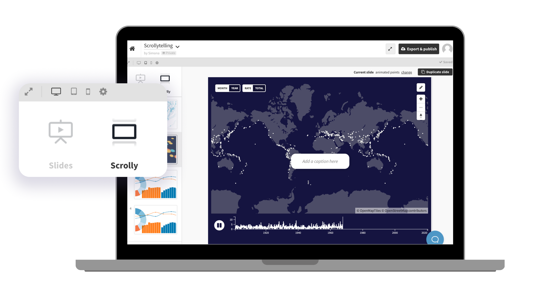
]]>Learn the key distinctions and how to pick the right chart for your dataWhat great scrollytelling looks like — and how to build it yourselfhttps://flourish.studio/blog/scrollytelling-examples/2026-05-26T23:00:00.000Z2026-05-26T23:00:00.000ZMost data stories are built the same way: a chart, a caption, maybe a paragraph of context. Then another chart. Then another. By the third, your reader has already opened a new tab.
The issue isn’t the data. It’s the pacing. Presenting everything at once forces your audience to do all the interpretive work themselves — and most people won’t bother. They need to be guided.
That’s exactly what scrollytelling does. Instead of showing everything at once, content reveals itself step by step as your reader scrolls — so their journey through the page becomes the story. Charts animate, maps zoom, timelines advance. You show them one thing at a time, in the order that makes the most sense. They set the pace. You set the story.
This example shows how a single dataset can be transformed into a guided narrative — each scroll step revealing one insight at a time, so the reader never feels lost or overwhelmed.
Why scrollytelling works so well for data storytelling
Scrollytelling isn’t popular just because it looks great. There are real, human reasons why it works better than a static chart — especially when your data is complex, or your audience isn’t a room full of analysts.
Traditional charts often force readers to process everything at once. Scrollytelling breaks information into manageable moments, allowing you to reveal context gradually and direct attention to the most important insights.
As users scroll, charts can animate, filter, zoom, or transition between views. This creates a sense of progression that feels more natural than clicking through slides or jumping between static visuals.
At the same time, scrollytelling creates a stronger narrative flow. Instead of presenting disconnected charts, you guide readers through a structured journey with a beginning, middle, and end. This approach makes complex datasets feel approachable while helping viewers retain key information more effectively.
The scrolly below puts this into practice with a line chart that builds progressively, letting the reader absorb each data point before the next appears.
You can also use your scrolly captions to actively lead your audience through a complicated chart. Here the captions are actively directing the reader’s eye to the most important elements at each step.
When charts animate between states as your reader scrolls, they can watch change happen rather than mentally reconstructing it from two separate visuals. Smooth transitions make it easier to track movement, compare values, and notice patterns that might otherwise feel abrupt or invisible.
Highlighting specific data points, filtering down to a subset, or zooming into a region of a map — all of these create stronger continuity throughout your story. The reader always knows where they are, what changed, and why it matters.
The best scrollytelling pieces feel effortless to read. That simplicity doesn’t happen by accident — and Flourish gives you the tools to achieve it without compromising on quality or spending hours on production.
One idea per section: Focus on one key insight at each scroll step rather than presenting every finding at once. Build a curated sequence of story points that guides your reader through the data rather than overwhelming them with it.
Let your annotations do the work:Add labels, annotations, and highlights directly onto your visualizations. The most effective annotations don’t describe what the chart is showing; they reinforce the insight the reader should take away from it.
Use color to direct attention: Strategic highlighting is one of the most effective tools in scrollytelling. Keep secondary elements muted so the focal data point draws the eye. This visual hierarchy becomes especially powerful across multiple scroll transitions, where you want the reader’s eye to land in exactly the right place every time.
Build your scrolly in three simple steps
Building a scrollytelling piece used to mean hiring a developer, fighting with JavaScript libraries, and praying it didn’t break on mobile.
With Flourish, you can create immersive, scroll-driven stories directly in the story editor. The result? An experience that looks like it took a whole dev team to build — created by you, in a fraction of the time.
All it needs are three simple steps:
Create your visualizations: Start with any Flourish template. Add your slides in the story editor just as you would for any Flourish story, with captions, text, and annotations.
Switch to scrolly mode: Once your visualizations and captions are in place, select Scrolly in the story navigation settings. That’s it — your story becomes a scroll-driven experience in a single click.
Publish and embed anywhere: Publish your scrolly and embed it as you would with any other Flourish visualization or story. It looks great on every screen size, no extra setup needed.
Customize your captions further
You can also place your scrolly captions to the left or right of the chart. Placing captions to the side rather than overlaying the chart works particularly well here — the reader can read the caption and interact with the map simultaneously, without either competing for attention.
Why scrollytelling continues to grow
As online audiences become more selective with their attention, static charts often struggle to hold engagement. Scrollytelling offers a more natural and immersive way to communicate insights by combining narrative structure with interactive data visualization.
With Flourish, teams can create these experiences without relying on custom development or complex production workflows. Whether you’re building a newsroom feature, a branded report, or an educational project, scrollytelling helps transform data into something people genuinely want to explore.
And when readers stay engaged longer, the story behind the data becomes far more memorable.
]]>Discover scrollytelling examples and how Flourish makes scrollytelling possible without writing a single line of codeGrouped bar charts: What they are and when to use themhttps://flourish.studio/blog/grouped-bar-chart/2026-05-12T23:00:00.000Z2026-05-12T23:00:00.000ZBar charts are straightforward — until your data has more than one thing to say. When you need to compare not just categories, but sub-categories within each one, a grouped bar chart is often the right tool.
In this guide, we’ll explain what a grouped bar chart is, how it differs from a stacked bar chart, and how to build one in Flourish.
What is a grouped bar chart?
A grouped bar chart is a visualization that displays multiple data sets side by side, organized by category. Instead of showing just one value per category, it allows you to compare several sub-categories within each main group, making differences immediately visible.
In terms of structure, grouped bar charts are built around a primary category and a secondary category. The primary category determines how the bars are grouped (e.g., regions or years), while the secondary category defines the individual bars within each group (e.g., product types or departments). These bars are typically color-coded to make distinctions clear, and their height or length represents the numerical value.
In the example above, the countries are the primary category and the energy sources are the secondary category.
Grouped bar charts can be displayed either vertically or horizontally. Vertical charts are more common, but horizontal charts are often a better choice when working with long labels, as they provide more space and improve readability without requiring text rotation or truncation.
Grouped vs. stacked bar charts – what’s the difference?
Grouped bar charts are often compared to stacked bar charts, as both are used to visualize data with multiple categories. However, they serve different purposes and should be chosen based on what you want to communicate.
In a grouped bar chart, each sub-category is shown as a separate bar placed next to the other bars within the same group. This makes it easy to directly compare individual values across categories.
In contrast, a stacked bar chart combines sub-categories into a single bar. Each bar is divided into segments stacked on top of (or next to) each other, with each segment representing a subcategory. The total length or height of the bar represents the sum of all sub-categories.
While grouped bar charts are better for comparing individual values, stacked bar charts are designed to show how different parts contribute to a whole. They are particularly useful when you want to highlight both proportions and totals.
A simple way to decide: if you want to compare individual values across categories, use a grouped bar chart. If the story is about how parts add up to a whole, a stacked bar chart will serve you better.
Grouped bar chart examples
So when should you actually reach for a grouped bar chart? The format works best in a handful of recurring situations — here are the most common ones.
Firstly, a grouped bar chart is best used when the goal is to compare sub-categories within multiple groups. For example, comparing products across regions is one of the most common uses. Each region becomes a group, and each bar within it represents a product — making it easy to spot which product leads in each market and where patterns diverge.
Tracking performance over time is another typical use case. Here, each group might represent a specific time period, such as a year or quarter, while the bars represent different product lines or business units. This allows you to see not only how performance evolves over time, but also how different categories compare within each time period.
Survey and feedback data maps naturally onto this format too. If you’ve asked multiple departments the same set of questions, a grouped bar chart lets readers scan across departments and spot where responses differ most — something a table of numbers rarely makes obvious.
More broadly, grouped bar charts are useful for comparing performance metrics across teams, evaluating different methods under the same conditions, analyzing demographic data, or exploring financial data across categories. In all of these cases, the key advantage is the ability to make clear, side-by-side comparisons.
When not to use grouped bar charts
Grouped bar charts work best when you have a small number of groups and a manageable number of bars within each one — typically no more than three or four. If your data has many groups or many sub-categories, the chart can quickly become crowded and hard to read. In those cases, consider splitting the data into separate charts, filtering to the most relevant categories, or switching to a different chart type altogether.
If you’re showing how a single value changes continuously over time — monthly revenue over two years, for example — a line chart will communicate the trend more clearly. If your primary goal is to show how sub-categories add up to a total, a stacked bar chart is better suited. And if you only have one category to compare, a simple bar chart is cleaner and less visually demanding. Choosing the right chart type isn’t about which looks most impressive — it’s about which makes your data easiest to understand.
How to create grouped and stacked bar charts in Flourish
In the data tab, assign your primary category — the variable that defines each group, such as region or year — to the Label column. Your sub-categories, such as product lines or departments, should each have their own column, as Flourish will treat each column as a separate bar within the group.
From there, you can explore a range of customization options. For example, you can choose from layout options such as a grid of charts. Refine the visual design by selecting colors, adding labels, and including a title and subtitle to provide context.
Taking the time to adjust these elements can make a significant difference in how clearly your data is communicated. A well-designed chart not only presents information accurately but also makes it easy for your audience to understand key insights at a glance.
Take a look at our blog posts below for more inspiration.
]]>A clear guide to comparing categories side by side, and how to build them in FlourishWhat are radial hierarchy charts and how to create one (with examples)https://flourish.studio/blog/radial-charts-guide/2026-05-07T23:00:00.000Z2026-05-07T23:00:00.000ZRadial hierarchy charts can look visually engaging at first glance, but they’re often misunderstood. When should you use one? And more importantly, what do they actually help your audience see?
In this guide, we’ll explain how radial hierarchy charts work, explore the difference between radial trees and sunburst diagrams, and show how to create your own in Flourish.
A radial hierarchy chart displays hierarchical data, but in a circular layout. Categories branch out from a central point, showing how parent groups break down into smaller child groups.
Instead of focusing on precise comparisons, these charts are designed to show structure – how data is organized and how different parts relate to each other.
There are two main types of radial hierarchy charts:
Sunburst diagrams: use nested rings. Each ring represents a level in the hierarchy, and each segment represents a category. The size of each segment can also reflect value, making it possible to see both structure and proportion at the same time.
Radial trees: use nodes and connecting lines arranged in a circular layout. They focus largely on relationships, showing how each node connects back to its parent.
How radial hierarchy charts differ from other charts
Radial hierarchy charts aren’t circular for pure aesthetics – their layout helps show how categories connect within a larger structure. Here is how they compare to other popular chart types:
Radial hierarchy charts vs bar charts
Bar charts focus on comparisons, using a linear axis to show values precisely. They tell you which category is larger or smaller, and by how much.
On the other hand, treemaps and other hierarchical charts show structure and proportion at the same time, using area to reveal how parts make up a whole — across multiple levels at once. The circular layout makes it easier to understand how subcategories relate back to a common root.
For example, if you want to compare sales across countries, a bar chart makes it easy to see that the US outsells Germany, and by exactly how much. Radial hierarchy charts trade that precision for structure. Rather than just ranking countries by sales, a radial chart shows how countries sit within regions — and how those regions make up the global total.
Radial hierarchy charts vs other radial charts
Not all radial charts show hierarchy.
Some circular charts – like radial bar charts or radar charts – focus on comparing values. They use a circular shape, but each segment or axis represents something separate. In other words, the categories don’t connect to each other – they’re just arranged in a circle.
Radial hierarchy charts are different because each category has a parent, and each branch links back to a central starting point.
Radial tree vs sunburst diagrams: What’s the difference?
Now that we’ve looked at how radial hierarchy charts differ from other chart types, the next question is: what’s the difference between the radial hierarchy charts themselves?
Both radial trees and sunburst diagrams are circular, and both show hierarchical data branching out from a central point. But they’re designed to show different things.
A radial tree focuses on structure. It shows how categories are connected, with each node linking back to a parent. The layout helps you follow relationships and understand how the data is organized. The circular shape doesn’t always represent a total.
A sunburst chart works differently. It still shows hierarchy, but it also encodes proportions. Each segment represents a share of its parent, and together they form a complete whole. The full 360° circle always represents a meaningful total.
How to create a radial hierarchy chart in Flourish
Your data should already be structured hierarchically (parent – child – sub-child) in a wide format, where each row represents a single data point. In the Data tab, you can then choose how to order these levels to define the parent–child hierarchy in your treemap.
The order you select your columns in the Categories/nesting setting determines the hierarchy — the first column you choose becomes the parent, and each subsequent column becomes the next level down.
One of the benefits of the Flourish Hierarchy template is that you can easily switch between hierarchy formats directly in the editor. Explore whether your data works better as a sunburst or radial tree, or try a different nested structure like a treemap or packed circles.
From there, you can choose how many levels to show, set your series colors, and more. You can also add your chart to a Flourish story to step through different levels of the hierarchy and guide your audience through it – like the chart below.
]]>Understand how radial charts work – explore radial trees, sunburst diagrams, and when to use each8 types of charts you need to master data visualizationhttps://flourish.studio/blog/different-types-of-charts/2026-04-12T23:00:00.000Z2026-04-12T23:00:00.000ZIf you’re just starting with data visualization, you’ll quickly notice there are many different chart types to choose from.
The good news is that most of them are built around a few simple patterns. Once you understand those, it becomes much easier to recognize what you’re looking at, and what each chart is trying to show.
We’ve already covered how to choose the right chart type for your data in more detail, but if you’re looking for an even simpler starting point, this guide is for you.
What are the main types of charts and graphs?
The most common types of charts and graphs used in data visualization include line, bar and pie charts, scatter plots, maps, Sankey diagrams, and others.
Each chart type is designed to show a specific pattern in data, from change over time to relationships between variables or distribution across categories.
A line chart is a type of chart used to show change over time. It’s great for tracking trends and seeing how things rise, fall, or stay consistent over a period.
How to read it: Most line charts have a horizontal X axis showing time (for example, months or years) and a vertical Y axis showing values. Start by checking what the Y axis represents – is it revenue, percentage, number of users, or something else? Then follow the line from left to right to see how it changes.
When to use it: When your data includes dates (hours, quarters, months, years) and you want to show how one or more things progressively change over time.
Tip: In Flourish, you can add labels directly onto your lines instead of relying on a separate legend. This makes charts much easier to read, especially when you have multiple lines, as users don’t need to move their eyes back and forth between the chart and the legend to understand what each line represents.
2. Bar and column charts – compare categories
A bar or column chart is a type of chart used to compare values across categories. It’s commonly used to compare things like sales by region or survey responses by category.
How to read it: Bar and column charts have one axis that shows categories (for example, countries) and another axis that shows values. In a column chart, categories are usually along the bottom, while in a bar chart they appear on the side – the difference is just orientation.
To read the chart, focus on length. The longer the bar or column, the larger the value.
When to use it: When you have different groups (such as countries, teams, or products) and you want to compare their values side by side.
Tip: Sort your bars in a logical order. In most cases, this means ordering them by value so patterns are easy to see – Flourish does this automatically for you. But if your categories follow a natural sequence (like time periods or ranges), keep that order instead so the chart remains intuitive.
3. Pie and donut charts – show parts of a whole
A pie or donut chart is a type of chart used to show how a whole is divided into parts. It’s best for illustrating proportions when each category contributes to a single total.
How to read it: Start by identifying the largest slice, as this gives you a clear reference point. Then compare the remaining slices relative to it. Each slice represents a proportion of the whole, so you’re always reading values in relation to the total.
When to use it: Use a pie or donut chart when all categories together make up a complete total (for example, 100%). This makes it ideal for showing things like market share, budget allocation, or traffic sources.
Tip: Keep the number of slices low – ideally no more than five to seven. If comparison becomes difficult, consider switching to a bar chart instead.
4. Scatter plots – reveal relationships
A scatter plot is a type of chart used to show the relationship between two variables. It’s useful for identifying patterns, trends, and outliers in your data.
How to read it: Scatter plots have two axes, each representing a numeric value. Each dot on the chart represents one data point (for example, a country, product, or campaign).
Instead of focusing on individual points, look at the overall pattern. Are the points forming a clear upward or downward trend? Are there clusters where many points group together? Are there any outliers that sit far away from the rest?
If size or color is used, this often represents an additional variable, adding more context to the chart.
When to use it: As a rule of thumb, if you have two sets of numbers and want to see how they relate, a scatter plot is a good choice. For example, ad spend vs conversions, price vs product rating, or income vs life expectancy.
A heatmap is a type of chart used to compare values across two categories using color. It’s especially useful for spotting patterns in data that would be hard to read in a table.
How to read it: Heatmaps are usually arranged as a grid, where each row and column represents a category, and each cell shows a value using color.
Start by checking the color scale to understand what high and low values look like. Then scan the chart for patterns.
Look for three things:
Patterns: Do values follow a trend, such as higher values in certain months or times of day?
Exceptions: Are there any cells that stand out from the rest?
Seasonality: Do similar patterns repeat across rows or columns?
Rather than focusing on individual cells, try to understand the overall structure of the data.
When to use it: Use a heatmap when you have two categorical variables and want to compare how they relate. For example, days of the week vs hours of the day, cities vs air quality levels, or months vs temperature.
Tip: Use a clear and intuitive color scale so differences are easy to see. For more guidance on using color effectively in data visualization, check out our blog post.
6. Sankey diagrams – visualize flows
A Sankey diagram is a type of chart used to show how a quantity flows between categories or stages. It’s ideal for visualizing how something moves, splits, or is distributed within a system.
How to read it: Sankey diagrams are most commonly read from left to right. The blocks (nodes) represent stages or categories, and the connecting bands show the flow between them.
Focus on two things:
Width of the flow: The thicker the band, the larger the value it represents. Thinner bands represent smaller values.
Splits and merges: Look at how flows divide into multiple paths or combine into one. This shows how a quantity is distributed or consolidated as it moves through the system.
When to use it: Use a Sankey diagram when a single quantity moves through a process or breaks down into subcategories. For example, how users move through a funnel, how a budget is allocated across departments, or how energy is distributed across sectors.
Tip: Use color and emphasis to guide attention. In Flourish, you can highlight key flows and mute less important ones using color overrides, helping users focus on the most important parts of the diagram.
A network graph is a type of chart used to show relationships between connected entities, such as people, organizations, or topics. It’s useful for understanding how things are linked within a system.
How to read it: Network graphs are made up of two main elements:
Nodes: The individual items (such as people or companies)
Links: The connections between them
Start by looking at the overall structure. Are there clusters of nodes grouped together? These often represent communities or closely related groups.
Then look for central nodes – items that have many connections. These are often more important or influential within the network.
If arrows are used, they show direction, helping you understand how relationships or influence flow from one node to another.
Rather than trying to read every connection, focus on how the network is organized and where the key relationships sit.
When to use it: Use a network graph when your data is about connections. For example, social networks, company ownership structures, or relationships between people, products, or ideas.
Tip: Network graphs can become complex quickly. In Flourish, interactivity helps you explore them step by step – you can hover over nodes to highlight connections, or use layouts like radial view to spread nodes more evenly and make the structure easier to read.
8. Treemaps – show hierarchical structure
A treemap is a type of chart used to display hierarchical data using nested rectangles. It’s ideal for showing both proportions and structure in a single view.
How to read it: Treemaps are made up of rectangles nested inside each other. Each rectangle represents a category, and its size reflects its value (for example, sales, population, or traffic).
Start by looking at the largest rectangles to understand the biggest contributors. Then look at how those rectangles are divided into smaller sections to see how the data breaks down.
When to use it: Use a treemap when your data has a hierarchy (for example, categories and subcategories) and you want to show how each part contributes to the whole. It’s also a good alternative to a pie chart when you have many categories, as it handles larger datasets more clearly.
Explore more guides on our blog to get the most out of your data and your charts.
]]>A beginner-friendly guide on what each chart shows, how to read it, and how to make it clearerHow to use radar charts for clear, insightful data storieshttps://flourish.studio/blog/create-online-radar-spider-charts/2026-03-29T23:00:00.000Z2026-03-29T23:00:00.000ZA radar chart, also known as a spider chart, is a widely used visualization style for comparing people, places, or other entities across multiple metrics. The metrics in the data need to share the same scale, so you’ll most commonly see radars used for percentage points or scores out of ten.
In Flourish, you can create a radar chart by opening the Radar Chart template and uploading a spreadsheet with one column per metric. From there, you can customize colors, labels, and interactivity, all without writing a line of code.
Small charts, big insights
One of the most effective radar chart layouts is a grid of small multiples.
Instead of adding many shapes to a single view, each radar chart gets its own mini-axis. This makes patterns easier to compare across players, teams, or categories.
With Flourish, you can switch between a combined view and an individual focus view with a single click. The grid layout is fully responsive, adapting smoothly across devices.
But that’s not all! If you want to go beyond a standard grid, radar charts can be arranged in custom positions, for example, portraying players on a football pitch, mapping players by region, or aligning with any structure that makes sense for your data. It’s a simple way to add more context and tell a stronger story.
Sometimes, comparing multiple radar charts at once can get overwhelming. That’s why certain design choices can make things easier.
Comparison lines, for example, create a subtle duplicate of each radar shape along every axis. This makes differences easier to spot while keeping the chart easy to understand.
You can also add an interactive legend that lets users click a color to show or hide specific groups. Want to focus on a particular category? Just toggle the legend to declutter the view and highlight what matters most. These small tweaks make radar charts more intuitive, helping users explore data in a way that works for them.
To make things even clearer, you can add group labels to the outside of the axis. This is especially useful when metrics relate to broader topics, such as seasons, regions, or different aspects of well-being.
In this example, the labels divide the months into seasons, making it easier to see how electricity usage changes throughout the year. The chart shows that US residential electricity consumption peaks in the summer months, with July and August consistently seeing the highest values.
Radar charts are especially useful for comparing multiple variables at a glance. For example, you might compare products based on features such as price, speed, quality, and design. Or you could evaluate an athlete’s performance using metrics such as speed, strength, and accuracy.
If you’re looking for inspiration, browsing real radar chart examples is a great way to see what works in practice. Explore interactive radar chart examples and learn more about how the template works on our dedicated radar charts page.
For broader inspiration across industries, take a look at our gallery of examples.
Reviewing different radar chart examples will quickly show you how thoughtful layout, clear labeling, and strategic color choices can significantly improve readability and impact.
The downsides of radar charts
While the radar chart is visually striking, it does have limitations.
The overall shape depends significantly on the order of metrics around the circle. Changing the order can alter the shape without changing the data itself.
The area can exaggerate differences. In a traditional area chart, doubling values doubles the area. In a radar chart, the area grows disproportionately, which can mislead viewers.
Connecting discrete metrics with continuous lines may imply relationships that do not exist.
A clearer alternative: radial bar and stellar charts
When clarity is the top priority, radial bar charts and stellar charts can offer a stronger solution.
Unlike a traditional radar chart, radial bar charts use independent bars arranged in a circle. Since the bars aren’t connected, the metric order doesn’t distort the results. This makes values easier to compare directly.
Stellar charts, a term coined by Alexandre Morin-Chassé, use tapering bars to create a smooth, dynamic look while maintaining independent scales. Unlike radars, these alternatives make values easier to compare by using independent bars.
In Flourish, you can switch between a radar chart and a radial bar or “Star” mode in just a few clicks by adjusting stroke, fill, and inner radius settings. This flexibility allows you to test which format communicates your story most clearly.
PS: Did you ever notice that the Flourish logo is actually a stellar chart? 👀 Learn more about the rationale behind our refreshed branding on our blog.
Choosing the right chart
A radar chart works best when you want to compare several numerical variables across two or more items. It’s especially useful for performance comparisons and gap analysis.
The downside is that with too many data series, the chart can become cluttered and hard to read. In that case, a radial bar or stellar chart is often a better choice.
Sometimes these formats tell the same story more clearly and precisely. With Flourish, you can easily switch between formats and create interactive visuals that turn complex comparisons into clear, intuitive stories.
Take a look at our blog posts below for more inspiration.
]]>Learn when radar charts work, when they mislead, and how to create clearer alternatives with FlourishBar graph vs line graph: how to choose the right charthttps://flourish.studio/blog/bar-vs-line-graph/2026-03-20T00:00:00.000Z2026-03-20T00:00:00.000ZIf you regularly work with data visualization, you’ve probably asked yourself at some point: bar graph or line graph?
It may seem like a small design decision, but the chart you choose directly affects how quickly and effectively your audience interprets the data.
How chart choice impacts clarity
Choosing between a line graph and a bar graph ultimately comes down to the story you want to tell.
A bar graph compares categories. Each bar represents a distinct group, allowing viewers to see differences in volume and immediately understand which category is performing better.
A line graph, on the other hand, connects data points across a continuous scale, usually over time. It highlights progression and direction rather than isolated values.
For example, if you are reporting on monthly revenue, a bar chart presents each month as a separate performance result. A line chart shows whether revenue is increasing, declining, or fluctuating throughout the year.
Choosing the wrong format can suggest patterns that don’t exist or hide the ones that do. That’s why selecting the right chart type is not just a visual choice, but a communication decision.
When to use a bar graph vs a line graph
Line graph
Line charts are designed to show change over time. If the key question is “How did we get here?” rather than “Who performed best?”, a line graph is usually the better option.
They make trends, seasonality, and volatility immediately visible.
In these situations, change over time isn’t the focus; contrast is. The goal is for your audience to instantly see which category is larger or smaller, which one is leading, and which one is falling behind.
Making the right choice for clearer reporting
When a chart doesn’t immediately answer the viewer’s questions, interpretation becomes harder, and confusion increases.
In many cases, the best answer to the dilemma of which graph to use is to use both, with each telling a different side of the story. A performance dashboard, for example, might include:
A line chart to show overall growth over time
Bar charts to compare performance across regions or teams
Ultimately, the guiding principle is simple:
If categories stand alone: use a bar graph.
If data points form a sequence: use a line graph.
If you need both comparison and trajectory: consider using both.
Create the perfect visualization with Flourish
Flourish makes it easy to choose the format that best supports your story.
Start by selecting a chart from the template chooser, or use Start with data and let Flourish suggest a chart type based on your dataset.
If you later realize another format might explain your data more clearly, there’s no need to rebuild or reformat anything. Switching from a line chart to a bar chart (or the other way around) takes a single click. The editor updates instantly, so you can compare versions and decide which one communicates your message more effectively.
For deeper exploration, you can also turn a single chart into a grid of charts to compare multiple categories at once — especially useful when one view doesn’t tell the whole story.
All of this happens in the chart editor, with full control over labels, colors, filters, annotations, and interactions — and without writing any code. Learn more in our help doc.
To sum up: bar graph or line graph?
The decision to use a bar graph or a line graph depends on the story you want to tell. If you want to showcase change over time, a line graph is the better option. If you want to compare different categories, choose a bar graph. In some cases, you can use both to present different sides of the same story.
Take a look at our blog posts below for more inspiration.
]]>A clear breakdown of when to use bar graphs versus line graphs — and how to choose the right one for your data.After 3,000+ charts, here’s why I trust Flourish for interactive data storieshttps://flourish.studio/blog/best-data-visualization-tool-for-newsrooms/2026-03-02T00:00:00.000Z2026-03-02T00:00:00.000Z
David Foster Data Visualization Expert, prev. Yahoo Finance
Yahoo Finance was the first place where I could clearly see how data visualization affects reader behavior. Because we were able to tag Flourish embeds in our monthly active user dashboard, we could see the direct impact: stories with visuals consistently had higher engagement and longer time on page.
Graphics became essential entry points into stories. A well-designed chart or map could pull someone in instantly, especially on social. And with more complex formats like scrollytelling pieces, the combination of motion, pacing, and narrative often sparked big conversations in the comments.
In a digital newsroom fighting for attention, data storytelling helps shape what gets covered, how it gets framed, and how deeply people engage with it.
Before Flourish, my workflow involved multiple tools – QGIS, RAWGraphs, Illustrator – and a lot of exporting, restyling, and troubleshooting. Maps in particular required juggling files and rebuilding design elements by hand. Everything took longer than it needed to, and in a newsroom, speed is critical.
The Flourish effect: quick, on-brand data visualizations at scale
Flourish changed the old workflow immediately. Suddenly, I could go from data to a polished, interactive visualization in the same tool. The template library covered almost every chart type we used, and the branded themes meant everything matched our visual identity automatically. Plus, being able to duplicate a project to make a series became incredibly fast.
It also improved team collaboration. Instead of Illustrator files living on someone’s desktop, Flourish projects are cloud-based, so anyone could jump in and build off the work. Even when our CMS couldn’t support JavaScript embeds, Flourish worked with us to create an iframe solution so we could still produce scrollytelling pieces. It completely streamlined how we produced visuals in the newsroom.
And just as importantly, a single graph could be published once and reused everywhere - from articles to social media. The flexible export options and responsive interactive embeds made the process quick and easy.
How Flourish makes financial data easier to grasp
Flourish has powerful, flexible templates that are ideal for financial storytelling, and its ability to pull in live CSVs from finance APIs makes it a natural fit for visualizing fast-moving market data.
Plus, the template variety helped me support a variety of stories. Here are my favorites:
How I use Flourish vs Excel and Tableau
Are you wondering what is the difference is between Flourish and Excel, or Tableau?
I use Excel for analysis and Tableau for exploration, but not for final, public-facing graphics. Flourish fills that gap. It’s incredibly easy to learn if you’re already comfortable with Excel or Tableau, but gives you far more design control and interactivity. If you want to turn raw financial data into something clear, elegant, and engaging for a mass audience, Flourish is the tool I reach for.
Flourish transformed everything for us at Yahoo Finance. Its interactive templates let us produce clean, engaging visuals instantly, and moving to a web-based workflow meant the whole team could access and build off each other’s projects effortlessly.
David Foster is a data visualization expert and former graphics lead at Yahoo Finance, where he built the newsroom’s visualization practice and produced thousands of charts, maps, and interactive stories. With more than 30 years of experience across PC Magazine, BusinessWeek, Fortune, and major PR and marketing agencies such as Edelman, he blends editorial judgment with thoughtful design to make complex financial and economic data accessible. He specializes in scrollytelling, financial visualization, and creating scalable visual systems for newsrooms and brands.
]]>Why I think Flourish is the best data visualization tool for newsroomsHow to grab attention with data – my checklist for interactive storytellinghttps://flourish.studio/blog/how-interactive-data-visualization-holds-attention/2026-02-03T00:00:00.000Z2026-02-03T00:00:00.000Z
David Foster Data Visualization Expert, prev. Yahoo Finance
I spent years creating graphics without any real sense of how readers were responding. That changed at Yahoo Finance when I started publishing Flourish interactive charts in real time.
Suddenly, we could see how people engaged; people spent longer with the stories, scrolled through the content, and the visualizations sparked more conversation in the comments.
The scrollytelling story I published this past June (“The $11 Trillion Gap…”) is a good example. It drew more than 5,500 comments. That kind of response showed me how a thoughtful visual treatment can anchor a complex story and pull readers into a deeper discussion.
As a reader, great scrollytelling work can be genuinely jaw-dropping. Seeing a complex story visually untangle itself, through zoom, reveal, and sequencing, makes the stakes far more visceral than text alone.
Using the Flourish scrolly is especially powerful for a story that unfolds through competing claims or shifting frames. In those cases, a single chart can’t capture the back-and-forth. A scrolly lets you map out different visual states and guide the reader through them step-by-step: like a slide deck where the reader controls the pace.
Here is a creative example of using a Flourish scrolly to showcase where not to buy pizza in New York city. It follows a simple four-step flow:
Interactivity feels cumbersome, like a detour from the point
You don’t have a platform to host responsive graphics
Even standalone charts often benefit from small, purposeful interactive elements – such as filters, popups and panels, or filterable legends. These give readers the freedom to explore the data at their own pace, focus on what’s most relevant to them, and uncover patterns on their own.
A good interactivte data visualization will feel deliberate, elegant, and functional. The interaction should help the idea click, not call attention to itself.
Why I use Flourish for interactive visualizations
Quite simply, Flourish is the data visualization tool I always wished existed. The interface is intuitive, the templates are versatile, and the preview within the data workflow makes it feel natural to experiment. I rely heavily on the story and scrolly templates. As I have already shared, being able to zoom a map, reveal annotations, or guide a reader step-by-step without writing code is huge.
Seeing a complex story visually untangle itself, through zoom, reveal, and sequencing, makes the stakes far more visceral than text alone.
While I share what I absolutely love about Flourish, let me introduce you to some hidden gems that often go unnoticed:
David Foster is a data visualization expert and former graphics lead at Yahoo Finance, where he built the newsroom’s visualization practice and produced thousands of charts, maps, and interactive stories. With more than 30 years of experience across PC Magazine, BusinessWeek, Fortune, and major PR and marketing agencies such as Edelman, he blends editorial judgment with thoughtful design to make complex financial and economic data accessible. He specializes in scrollytelling, financial visualization, and creating scalable visual systems for newsrooms and brands.
]]>What 3000 charts taught me about creating engaging visualizationsVisualize the World Cup: 15 charts to power your football coveragehttps://flourish.studio/blog/world-cup-euros-football-data-visualization/2026-01-27T00:00:00.000Z2026-01-27T00:00:00.000Z#visible-mobile { display: none !important;}@media only screen and (max-width: 500px) { #visible-mobile { display: inline !important; } #hidden-mobile { display: none !important; }}.fl-scrolly-caption p { font-size: 1.25em!important; }
From fixtures and group tables to player stats and match results, football tournaments produce an endless stream of data. With the FIFA World Cup 2026 on the horizon, you need clear, flexible ways to visualize that information. The right charts make it easier to explain what’s happening on the pitch and help your audience follow every stage of the tournament.
Whether you’re tracking fixtures, following teams through the knockout stages, or analyzing player performance, use these 15 interactive football charts to visualize the tournament with clarity.
No tournament coverage is complete without these essential chart types. Whether you’re short on time or simply aiming to wow your audience, rest assured – our Flourish templates will take your reporting to the next level! Explore graphs that are both highly customizable and easy to make, such as the Tournament chart, Table, and Bar Chart Race.
Visualize fixtures with Tournament bracket charts and tables
Our interactive Tournament template provides a clear and simple way to map out the knockout stages of any tournament. Perfect for featuring on your homepage, this visualization type lets your readers easily track their favorite event’s unfolding story.
Visualize any stage of the tournament, from the round of 32 to the final
Add an extra column for the winner of each game, or leave it empty for future matches; the template clearly indicates fixtures yet to be played
Enhance your chart with custom visuals such as flags or player photos, a background image for added depth, and custom colors that match your brand
Turn fixtures into a searchable, color-coded schedule
If you’re looking for a neat way to lay out all upcoming matches, a table could just be the ticket. While our Tournament template captures the competitive flow from match to match, a table layout offers a straightforward snapshot of who plays against whom, where, and when.
The Table template is designed with versatility in mind, allowing you to:
As with all Flourish templates, the Table is very flexible – you can stick to the basics or include additional details like scores, making it as rich in information as you need.
If you want your fixtures to feel more visual than a standard spreadsheet, the Table template supports color-coded cells, so you can turn match listings into a clean, scannable schedule. You can color individual cells to highlight key matches, teams, or time slots, or use conditional formatting across an entire row or column (for example, by group, venue, kickoff time, or match status).
This added styling flexibility also makes it possible to build calendar-style layouts and even heatmap-style tables that help patterns stand out at a glance.
And for those who love going the extra mile with their data, you’ll appreciate a standout feature of our tables – the mini bar and line charts! They effortlessly turn your numbers into engaging graphs right within the table cells.
If you’re subscribed to one of our premium plans, you can link your visualizations directly to a live-updating CSV file. This means your charts will automatically refresh and republish as your data changes, ensuring your visuals are always current. The live data feature is incredibly handy for keeping charts updated in real-time scenarios, like tracking the progress of a game. Check out our blog post to learn more.
See the World Cup from every angle: venues, winners, rankings
Using one of our interactive map templates, you can share a detailed look at the history of tournaments or point out the locations of upcoming events, along with key game facts.
Use customized popups as in the example below to share more information about each point or region, without overcrowding your map. From adding rich text, custom HTML and CSS, vibrant videos and images, to even embedding Flourish charts, popups are ideal for interactive World Cup data visualization.
Hover over any host city to see photos of each venue:
Curious to see which nations have climbed to the top of the world in football? Our interactive Sankey Diagram lays out the tally of World Cup wins, giving a clear picture of each country’s success over the years. It’s an intuitive way to compare countries’ historical performance and make long-running rivalries and dynasties easy to grasp.
And if animation is what you’re after, our Bar Chart Race template is the perfect match for your needs. It’s perfect for visualizing how teams move over time, like shifts in FIFA rankings, qualification performance, or changes across tournament cycles.
To get started with a Bar Chart Race, your data should have:
A row for each participant
A column for each time period, and should be cumulative – i.e. it should reflect the total FIFA ranking points accumulated by each team up to that date.
You can also add images or flags and timed captions
For a step-by-step guide on setting up your data for a flawless Bar Chart Race, take a look at our help doc.
World Cup player data: squad guides, profiles, and formations
If you’re covering a tournament, you’ll need a clear way to present squads, lineups, and player stats. As you build your World Cup data visualization, player profiles and lineups help your audience quickly understand who’s on the pitch, what roles they play, and how teams set up for each match.
With Flourish templates like Cards and Sports, you can turn player data into interactive visuals that are easy to publish and update throughout the tournament.
Show players info at a glance with interactive visualizations
Our versatile Cards template is perfect for visualizing team and player profiles, plus extra context. With the Cards template, you can:
Build interactive player and team profiles with rich supporting details
Visualize formations and tactics with the Sports template
To gain a deeper understanding of every football match, you can use our Sports template which turns the complex world of team formations and tactics into vibrant, animated stories. It’s particularly useful for World Cup match previews and recaps – whether you’re showing a starting XI, highlighting a tactical change, or breaking down a key moment in the game.
In our template chooser, you’ll find multiple starting points of this template – from full to a half pitch, to a lineup with flags, images or numbers, explore the versatility of this template yourself below.
To accommodate unexpected formations, our Sports template allows you to plot each player individually. Simply provide an X and Y position in your dataset or use the custom formation box in the Preview tab. Read more about this on our help page.
Break down player stats with sunburst and bar charts
The Hierarchy template helps you break down World Cup player data into clear, clickable categories – ideal for exploring club affiliations, leagues, confederations, and player pipelines at a glance.
With the added functionality of filters and clickable segments, you can easily navigate through the sunburst diagram to learn more about the players’ club affiliations. Give it a go!
Besides the sunburst layout, the Hierarchy template offers a variety of other formats including treemaps, radial trees, packed circles, and stacked bar charts. All these options are readily accessible in our template chooser, but you can also easily experiment with different views right within the visualization editor. Read more about this chart type here.
One of Flourish’s standout features is the effortless creation of a grid of charts (also called small multiples) directly in the visualization editor. Instead of switching between separate charts, you can place multiple views side by side and compare them instantly – perfect for football data visualization, where patterns only become obvious when you look across teams, groups, or matches.
For tournament reporting, small multiples are especially useful when you want to:
Compare player stats across squads
Scan group-stage trends at a glance
Spot outliers (like unusually high shots, possession, or xG) across teams
Show the same metric for every team using different scales
Because every chart in the grid follows the same format, your audience can read and compare the data much faster – making this a strong technique for World Cup data visualization and match analysis.
Some stories need more than fixtures and final scores. For those who revel in the complex layers of football data, we’ve put together some visualizations that are a great match for any sports outlet or publication. These insights provide a deeper understanding of player efficiency, team dynamics, and tactical effectiveness.
Compare xG and goals with a scatter plot
One of the clearest ways to turn match analytics into a story is to compare expected goals vs actual goals. In the example below, we use a scatter plot to show whether teams at the 2022 World Cup finished above or below expectation (measured as goals scored per 90 minutes).
The result is a chart that helps readers quickly spot over-performers and under-performers – ideal for match reports, previews, and post-game analysis throughout the tournament.
As both the examples above and below show, scatter plots bring a special kind of clarity to sports data. They allow your data to speak for itself, offering insights that might be less apparent with other chart types. Whether you’re opting for axis highlights or annotations, selective labeling or coordinating colors for clarity, the Scatter plot template becomes an essential tool for unpacking the layers of football tournament data.
The same versatility applies to our Sports template, which is excellent for mapping out intricate football tactics with animated trail lines. This feature serves as a powerful tool for visualizing anything from Spain’s 2010 World Cup-winning strategies to a local team’s season-long development.
In the example above, we created an interactive scrollytelling piece, incorporating various setups of trail lines. This is an effective way to guide the viewer through a narrative, highlighting key moments and strategic shifts that define a team’s journey.
Flourish’s scrollytelling feature allows for an engaging, story-driven exploration of data, making complex tactical analysis not only accessible but also visually impactful. For a deeper dive into this feature, check out our blog post.
For the kicks: interactive quizzes
Wrapping up this guide, here are two quick ways to add a playful layer to your World Cup 2026 coverage and keep readers on the page longer. Use interactive formats like a Quiz or a Draw The Line chart to test predictions, spark debate, and collect fan opinions throughout the tournament.
Test football knowledge with a Draw The Line chart
The Draw The Line chart is a simple way to test how well your readers know the tournament. Ask them to draw the trend they expect based on the question—then reveal the real answer to see how close they were.
We hope these visualizations fuel your creativity and inspire you to craft your own standout pieces. For a deeper dive into sports data magic, check out our webinar on World Cup visualizations or browse our blog for insights on visualizing football league data.
]]>From fixtures to player stats, build interactive football visuals for every stage of the tournament